Sherwin-Williams Agreeable Gray: Paint Color Review
Disclosure: This post may contain affiliate links. As an Amazon Associate, I earn from qualifying purchases at no additional cost to you.
Is Agreeable Gray more gray or beige?
The simplest answer is that Sherwin-Williams Agreeable Gray SW7029 is gray with a slight warm beige undertone, aka the perfect greige. Yes, we like to blend paint color names just like celebrities – who knew Bennifer would be back together again – ha! Almost more important than the color itself, finding the best undertone will make all the difference in the success of your paint choices.
My goal is to share my personal experience with Sherwin-Williams Agreeable Gray to help you decide if it’s right for your home!
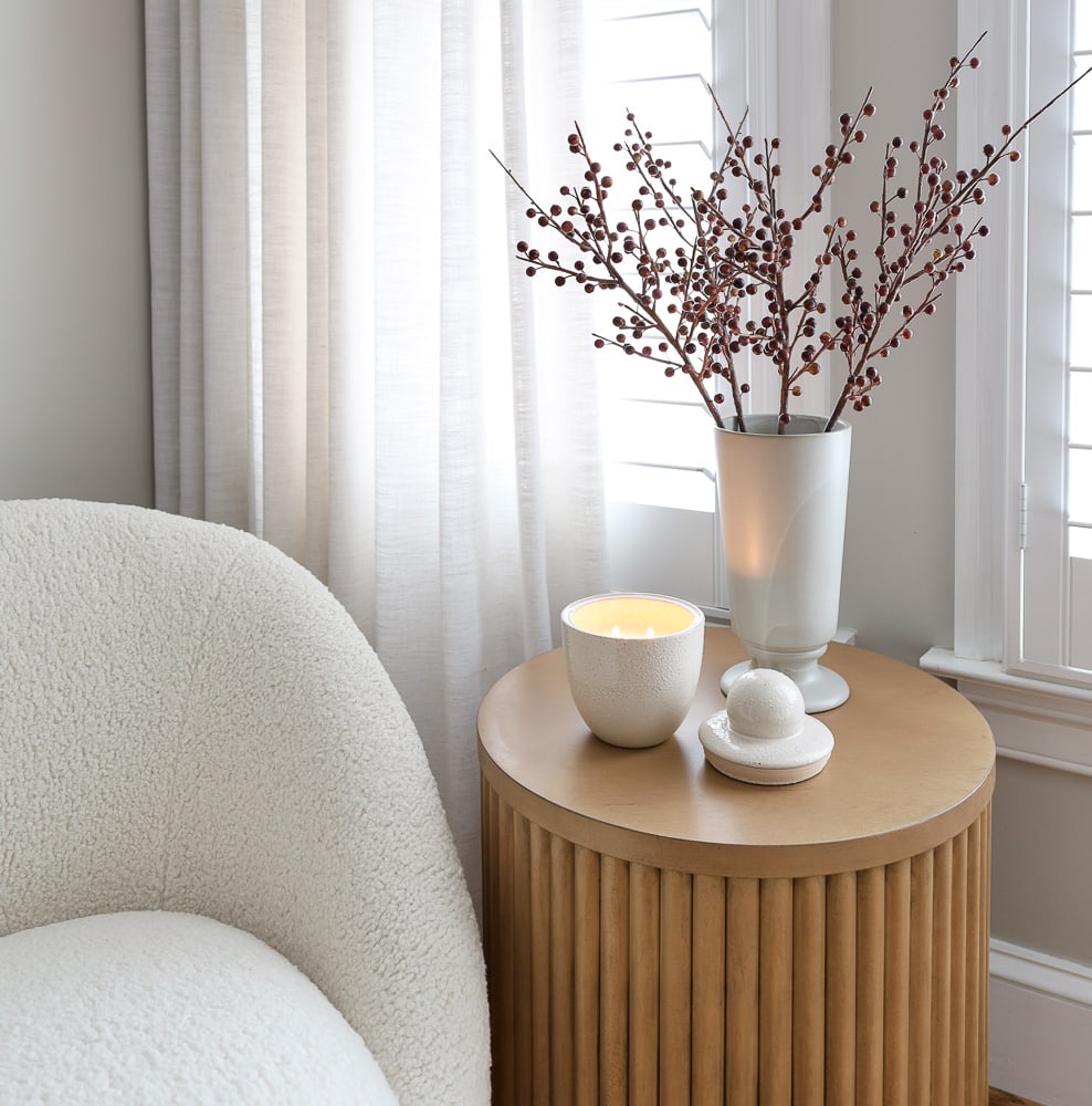
Pedestal (similar) | Drapes | Curtain Rod | Vase
Think about going to the salon…have you ever gotten a new color and it just doesn’t look that good? It might not be that you weren’t meant to be a blonde, brunette, or redhead. The likely culprit of your dissatisfaction may be the wrong undertone for your skin. The same goes for your walls!
Undertones may be warm with yellow or green, or lean a little cool with blue or purple. A friend painted her guest room gray, but in the ambient light, everyone thought it was purple! It’s beautiful, but it looks nothing like what she was expecting. This may be fine for a basement guest room, but if you expect a wall color to look a certain way in the main living area of your home, you may be very disappointed if you don’t first determine which undertone is best.
When searching for the best black paint for my basement stairs and media room, I was amazed to see how many shades of black paint exist.
Why does Agreeable Gray look different in every room?
Early morning light tends to be cool while the late afternoon light is warm. This can certainly affect how paint colors will look throughout the day. It also means that the same color will appear differently in east-facing rooms from west-facing rooms.
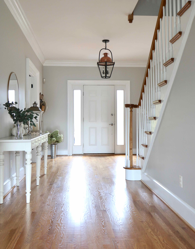
This is an old photo, but you can see what my stairway looked like on a gloomy overcast day – much darker and muddy in this light.
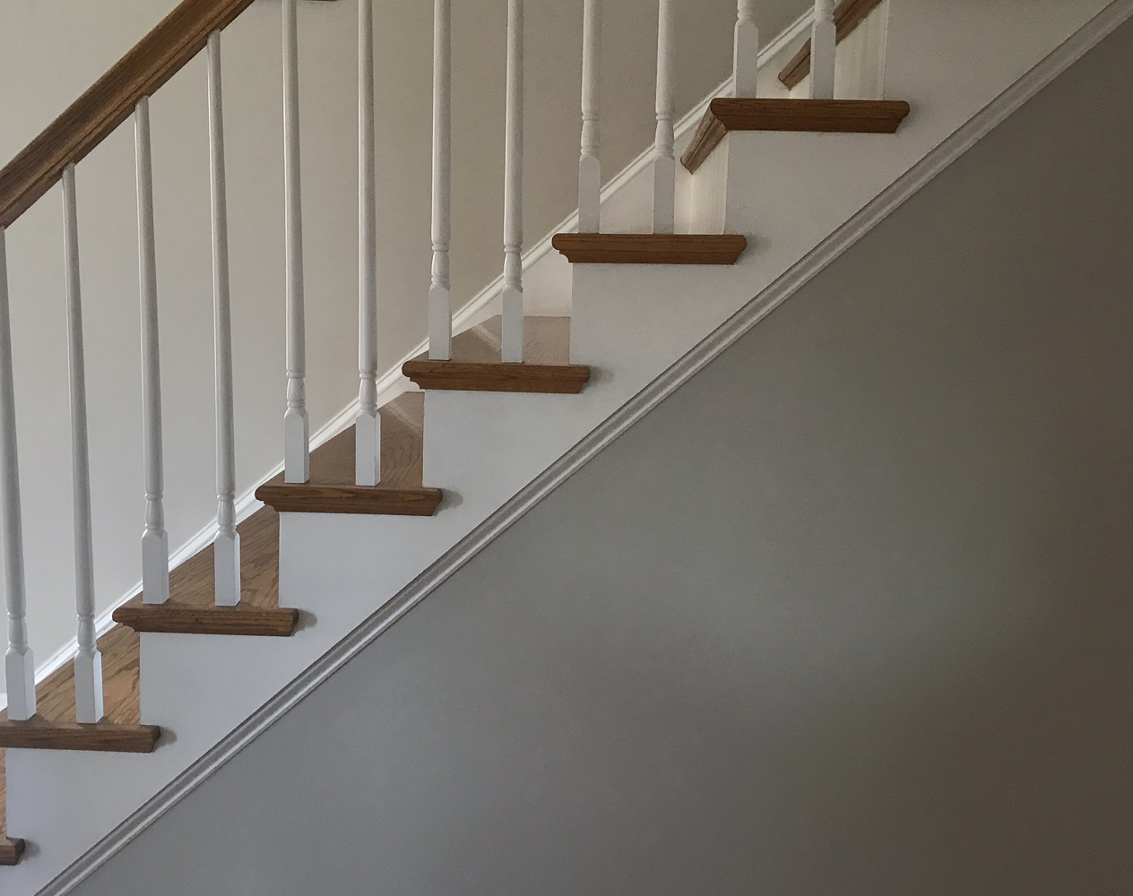
What about spaces without natural light? There are countless images on Pinterest showing what SW Agreeable Gray looks like in every imaginable space. However, you can’t trust some of the images you see online. You have no idea what the lighting situation is or how a photo was edited. I am sharing some old images from my home that show how ambient light – or lack thereof – can drastically change the look of paint.
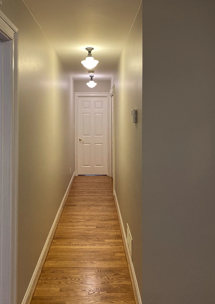
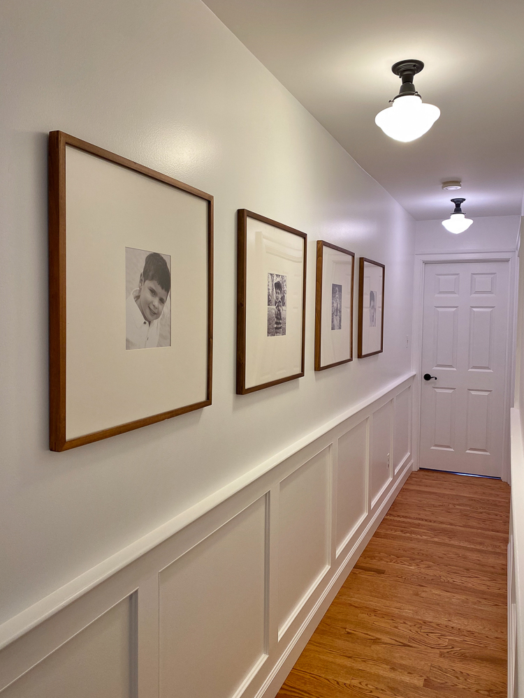
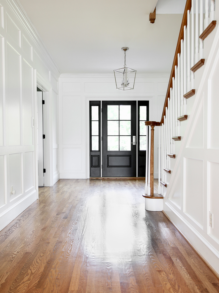
Most of the common areas in my home were once painted Agreeable Gray SW7029. It looked nice and I liked it. It came across as a light color in rooms with lots of natural light but dark and muddy everywhere else. The central areas of my home, like the stairway wall and upstairs hallway looked so dark and dreary. Yes, the LRV is 60 and it is considered reflective, but it was just not doing it for me in those areas. When I added wall molding, I painted everything bright white and I am much happier with how light those spaces look now.
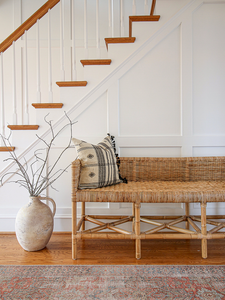
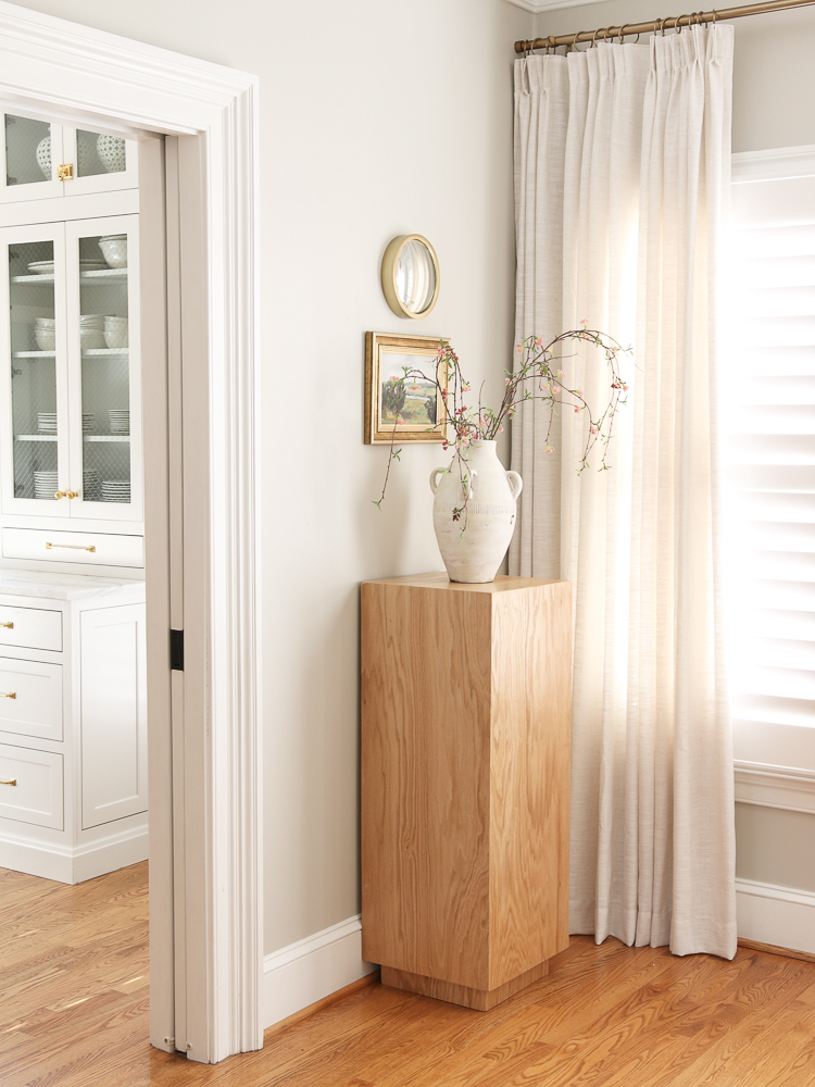
Serena & Lily bench | Artisan vase | Rug
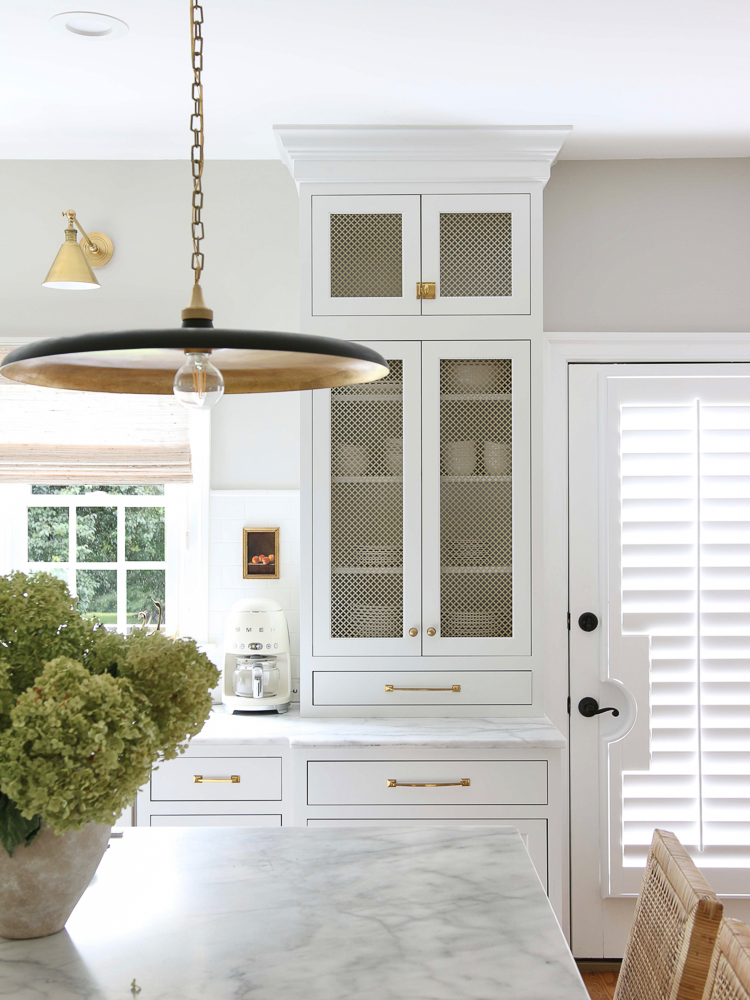
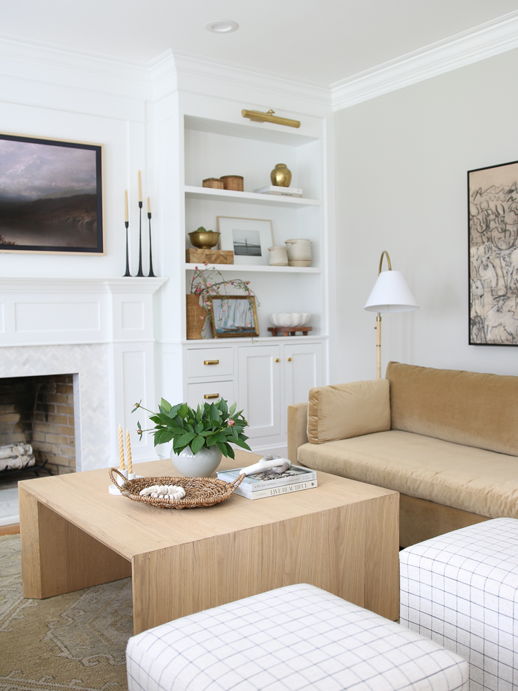
I repainted almost every room except for my kitchen and living room. We get lots of natural light there and the walls look nice and bright but still contrast with the white kitchen cabinets and living room built-in cabinets.
Why is choosing gray paint so hard?
When it comes to choosing paint colors, most of us simply take a trip to the closest home improvement store and spend countless minutes staring at little square samples. This conjures memories of being a kid trying to pick one piece of candy from the entire wall of goodies – impossible! You have an idea of what you want, but now you have to choose from the fifty different shades of the one color you are eyeing.
Gray has become a very popular paint color but is very hard to get just right. Technically, it’s a neutral paint color but the variations of undertones present a big challenge for most homeowners. In the early 2000s, the cooler blue or green undertones of gray were preferred. Lately, there has been a preference for warm undertones and everyone is looking for the perfect greige paint color.
Try it before you buy it
The only foolproof way to know if the paint will look good in a room is to test it out. I recommend buying a sample and paint swatches on all four walls in a room, not just one little patch. This way you can check it throughout the day in all lighting conditions – from bright sunny mornings to gloomy overcast afternoons.
While you’re at it, grab at least a couple of similar paint color options. You might end up liking them more than your original selection! This helped me pick the best color for my closet makeover too – Accessible Beige! It’s also a good way to sample coordinating colors in adjacent spaces before you commit to a full room or full house paint color.
Once you paint a few sample areas, pay attention to how each color dries. Paint does this tricky thing where it sometimes looks slightly different in the can vs. on the wall. It *should* match the paper paint swatch, but with so many lighting factors, you want to be sure. I never skip this step when choosing paint colors in my home.
Some brands have reusable peel-and-stick paint samples you can order that allow you to move them around. These are a convenient alternative that doesn’t require any painting supplies and won’t leave behind texture on the walls. Oftentimes, popular colors are available for purchase in-store – for all of you who need instant gratification!
What SW colors are similar to Agreeable Gray?
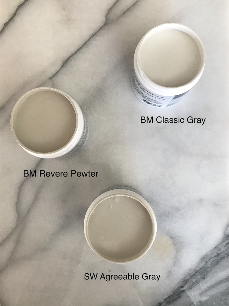
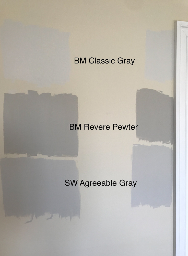
The two other paint colors I sampled are Benjamin Moore colors: Revere Pewter and Classic Gray. Not exactly the equivalent, but I wanted to try both lighter and darker options. I liked them all but had a Goldilocks moment and chose Agreeable Gray because it was in the middle and just right.
Here is a list of similar Sherwin-Williams colors to try when painting test swatches:
- Repose Gray
- Colonnade Gray
- Alpaca
- Mindful Gray
- Gossamer Veil
Paint color numbers – the nerdy stuff
Every paint color is assigned an RGB number which is a series of 3 numbers that represent the intensity of RED, GREEN, and BLUE in a particular color. The range for each color is between 0-255 with zero being the darkest and 225 being the lightest. If you do the math…there are over 16 million possibilities! Now you can understand why there are so many choices for EVERY color! Agreeable Gray has an RGB value of 209/203/193.
By comparison, Revere Pewter’s is RGB: 204/196/184. So when it comes to Agreeable Gray vs Revere Pewter – the two colors have very similar undertone values but Revere Pewter has a stronger red undertone.
The HEX number for color is made of 3 pairs of letters or numbers. Each pair is calculated from the RGB values to create a six-character combination. If you want to use a specific color on a computer screen graphic, you can simply type in the HEX number, and your color will pop right up. No guessing or trying to select the right spot on the color wheel! The HEX number for Agreeable Gray is #D1CBC1.
Have you seen the letters LRV and wondered what they mean? The LRV number of paint refers to its Light Reflectivity Value. You can tell how dark the color will be from the LRV. The higher the LRV, the more light it reflects which means it will be light and airy. The lower the LRV, the less light it reflects, and it will be dark and moody. For example, SW Black Magic LRV is 3.0. By contrast, the LRV for SW Pure White is 84.0. The LRV for Agreeable Gray is 60 which means it is on the light-reflecting side of the scale.
It’s so popular!
Agreeable Gray is Sherwin Williams’s most popular gray paint for a reason. It is close to being neutral but has the slightest hint of beige making it look great just about anywhere. Design enthusiasts have been using it for years, but it’s also loved by the real estate community. Most people have a hard time looking past what they think are decor flaws when house hunting. Just watch any HGTV show and you’ll see! You will have more success selling a home when a buyer can walk into a neutral space where they can imagine their stuff. This is difficult for buyers to do in a home where every room is a different color of the rainbow.
Check out my review of Benjamin Moore Storm Cloud Gray for the perfect green-gray paint!