Benjamin Moore Storm Cloud Gray: Paint Color Review
Disclosure: This post may contain affiliate links. As an Amazon Associate, I earn from qualifying purchases at no additional cost to you.
Is BM Storm Cloud Gray more gray or green?
According to the manufacturer, Benjamin Moore Storm Cloud Gray 2140-40, is classified as a dark gray with hazy green undertones. When you see the images online or in person, you’ll quickly see that this enigmatic shade has more of a sage green hue.
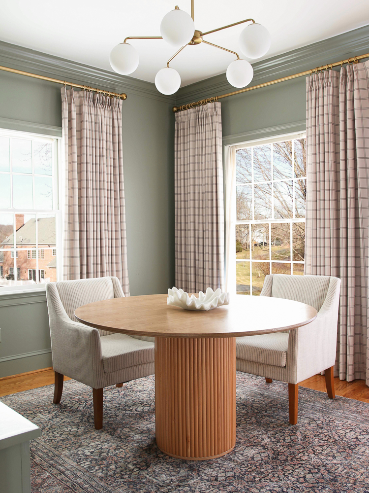
Drapes | Chandelier (similar) | Table | Chairs | Rug | Centerpiece bowl
I was actually searching for a green paint color for my home office so imagine my surprise when the color I choose doesn’t even have green in the name! Turns out, it’s the perfect grayish-green paint for a calm and sophisticated look.
My goal is to share my experience with this subtly bold yet soothing paint color. Don’t let the name fool you into leaving it off your list of possibilities!
Why do paint colors look different throughout the day?
Early morning light tends to be cool while the late afternoon light is warm. This can certainly affect how paint colors will look throughout the day. It also means that the same color will appear differently in east-facing rooms from west-facing rooms. In my review of SW Agreeable Gray, you can see the drastic difference!
What about spaces without natural light? There are plenty of images on Pinterest showing what BM Storm Cloud Gray looks like in every imaginable space.

Chandelier (similar) | Picture Light | Cremone bolts | Round knobs | Drawer pulls | Art (similar)
However, don’t rely on all the images you see online. You have no idea what the lighting situation is or how a photo was edited. Ambient light – or lack thereof – can drastically change the look of paint.
My office is in the front of my home which is northeast-facing. The bright morning light helps me get a fresh start to my work day. Even on cloudy days, I get a decent amount of ambient light, but it definitely affects how the wall paint looks. Keep this in mind when designing a room with a sage green color palette.
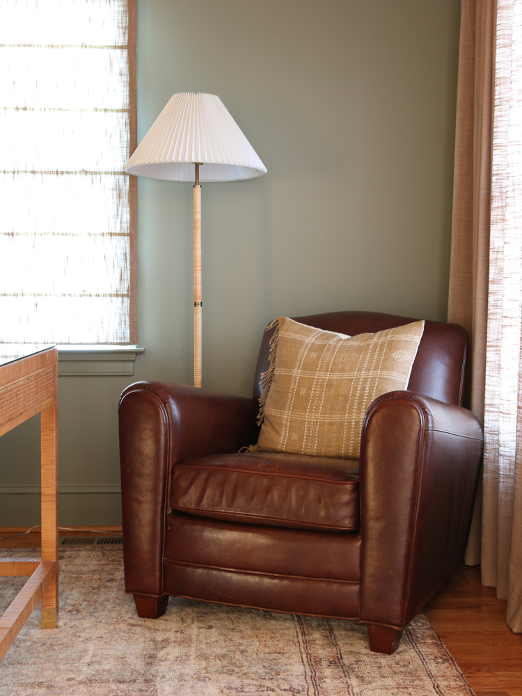
Leather chair | Rug | Drapes
As far as color temperature, I prefer to use warm artificial lighting in my home. To me, it just makes a space feel more relaxing and sets the perfect mood. The color temperature of the light bulbs you choose is a personal preference, but think about the effect it will have on paint with a green undertone. For more information, check out my post on home lighting design tips.
Why is it hard to find the right green paint?
When it comes to choosing paint colors, most of us head to the closest home improvement store and spend countless minutes staring at the wall of swatches. It’s virtually impossible to imagine what an entire room will look like based on one tiny square, especially under such harsh lighting.
A sage green aesthetic is popular for a reason. Unlike its vibrant counterparts, this warm and earthy shade of green is inspired by nature and creates a serene vibe. It’s a highly sought-after color for bedrooms or any space that needs a little bit of calm.
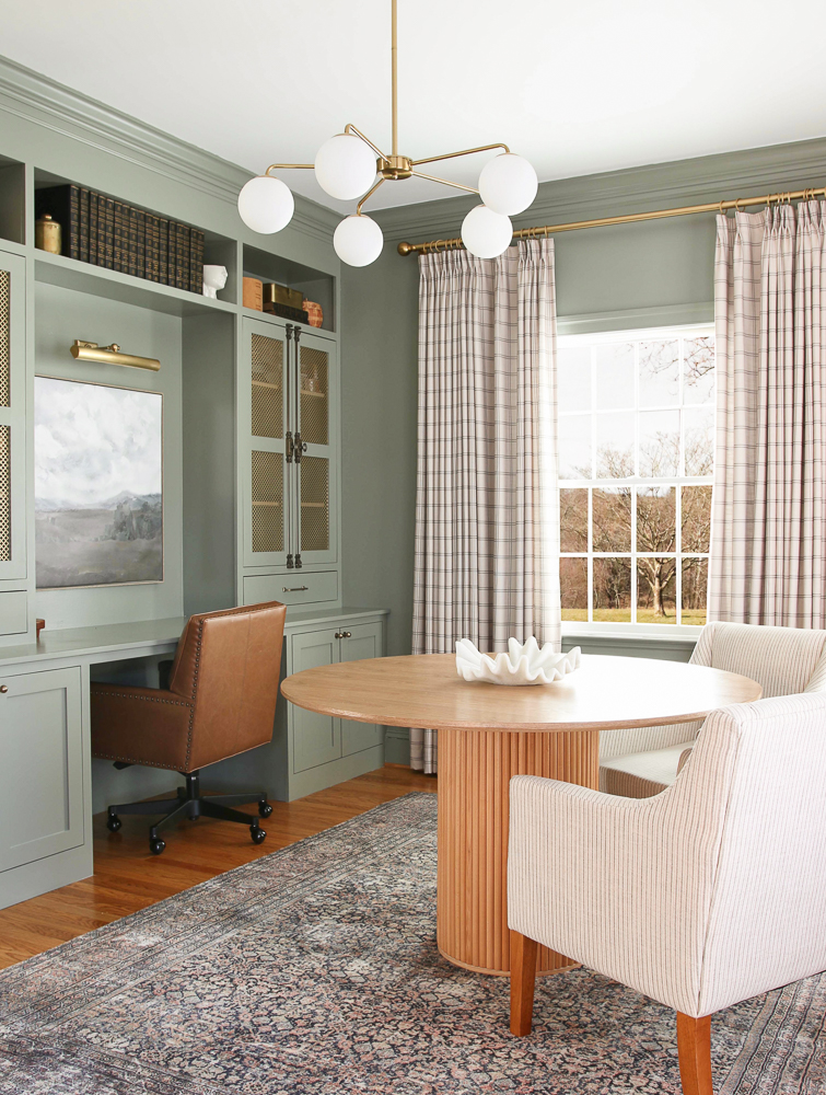
Drapes | Chandelier (similar) | Table | Chairs | Rug | Centerpiece bowl | Leather desk chair | Picture Light | Cremone bolts | Round knobs | Drawer pulls | Art (similar)
Work can be hectic, so making this environment a little more peaceful helps to balance things out. Benjamin Moore Storm Cloud Gray was the perfect choice to do just that.
As you can see in my review of SW Accessible Beige, wall color, and decor trends have moved away from cool or unsaturated tones and into warmer spaces. If you plan to add a warm shade of green or gray to your home, compare different undertones to see what looks best. There are way more than 50 shades of gray out there!
What colors are similar to BM Storm Cloud Gray?
One of the things I always recommend is to bring a few paint samples home and give them a test run on your walls. Be sure to add swatches on every wall in the room you plan to paint. This way you can get a good idea of what it will look like in every lighting situation. Leave them for a few days and check them throughout the day.
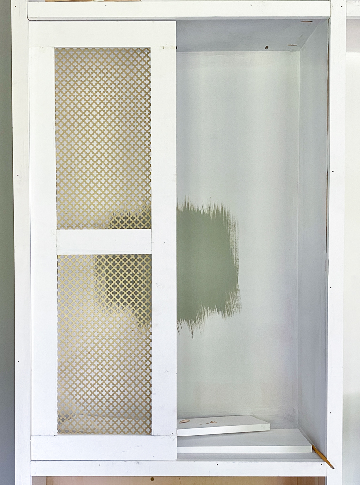
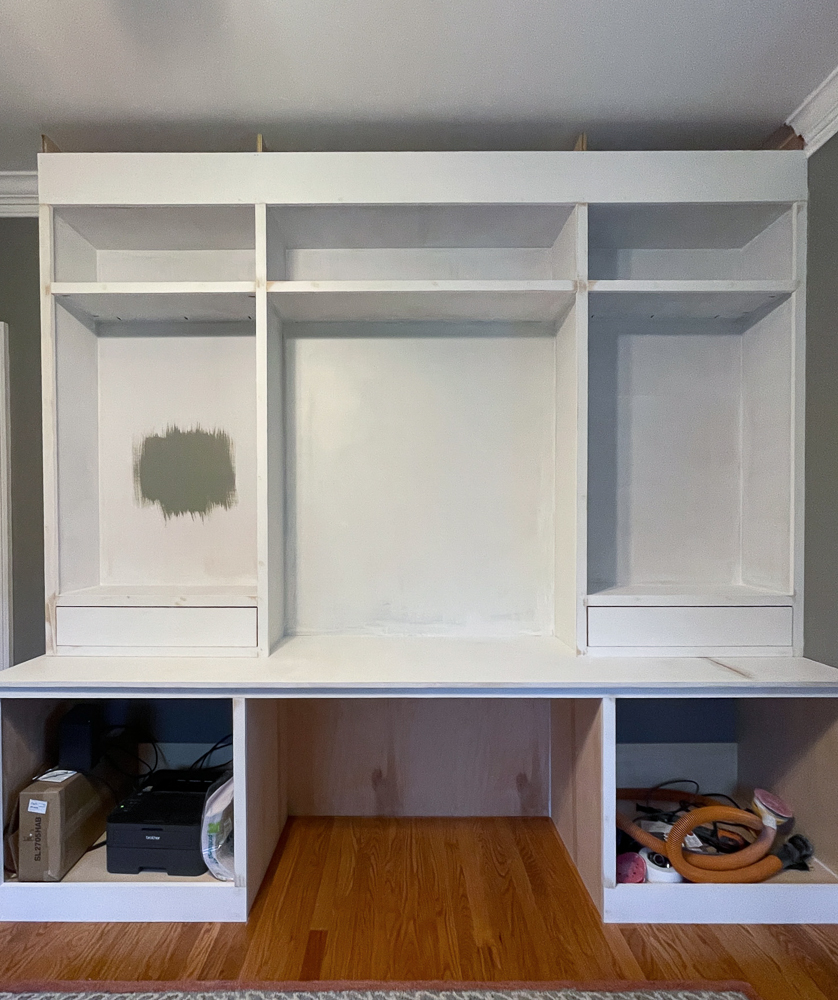
I did this during the construction phase of my office’s built-in cabinets. If you don’t want to bother with paint, peel-and-stick paint samples are a great alternative.
Here are a few other Benjamin Moore colors that are similar to Storm Cloud Gray:
- Desert Twilight 2137-40
- Creekside Green 2141-40
- Sage Mountain 1488
- Arctic Shadows 1559
From Sherwin-Williams:
- Cornwall Slate SW-9131
- Evergreen Fog SW-9130
Paint color numbers – what do they mean?
Every paint color is assigned a series of numbers and letters identifying its unique characteristics. These are important when it comes to creating a perfect match across brands.
Notice the difference in the color that morning vs afternoon light makes. Storm Cloud Gray looks like green paint in the warm light and much more gray in the cool tone of the afternoon. This room has eastern exposure.
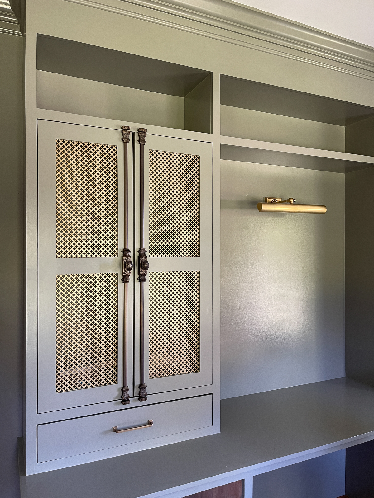
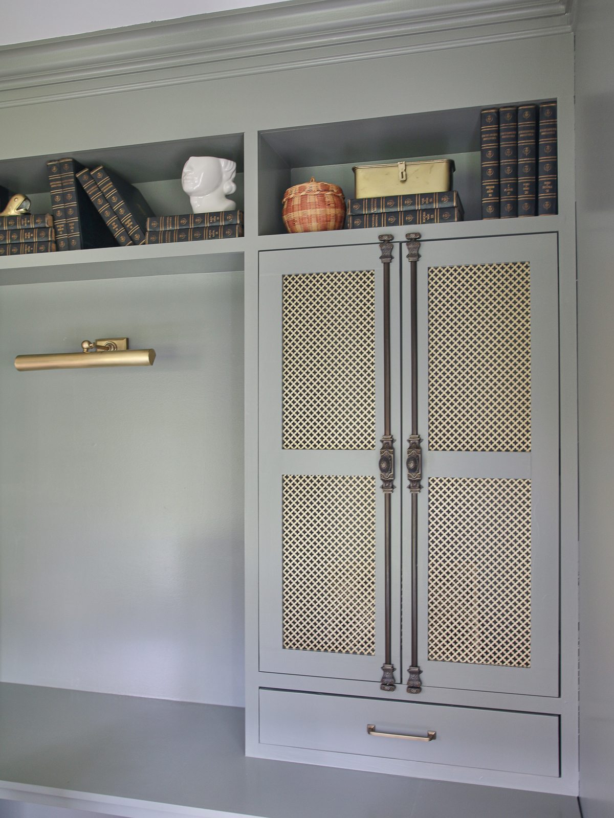
Cremone bolts | Drawer pulls | Picture light
RGB number
This is a series of 3 numbers that represent the intensity of RED, GREEN, and BLUE in a particular color. The range for each color is between 0-255 with zero being the darkest and 225 being the lightest.
If you do the math…there are millions of possibilities! Now you can understand why there are so many choices for EVERY color! Storm Cloud Gray has an RGB value of 146/145/131. By comparison, the Desert Twilight RGB is 143/138/126…so close!
HEX number
The HEX number for color is made of 3 pairs of letters or numbers. Each pair is calculated from the RGB values to create a six-character combination. If you want to use a specific color on a computer screen graphic, you can simply type in the HEX number, and your color will pop right up. No guessing or trying to select the right spot on the color wheel! The HEX number for Storm Cloud Gray is #929183.
LRV number
Have you seen the letters LRV and wondered what they mean? The LRV number of paint refers to its Light Reflectivity Value. You can tell how dark the color will be from the LRV. The higher the value, the more light it reflects which means it will be light and airy. The lower the value, the less light it reflects, and it will be dark and moody.
For example, SW Black Magic LRV is 3.0. By contrast, the LRV for SW Pure White is 84.0. The LRV for Storm Cloud Gray is 28.88 which means it is on the lower side of the light-reflecting scale.
Why is grayish-green paint so popular?
Every online search of home interiors will reveal this trendy hue because people are less afraid to use color in their homes these days. Benjamin Moore Storm Cloud Gray complements other popular colors and looks amazing with neutral wallpaper.
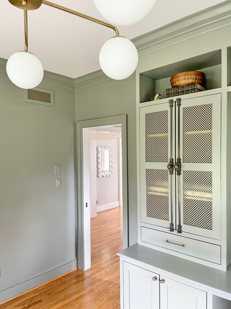
Chandelier (similar) | Cremone bolts | Round knobs | Drawer pulls | Mirror
It’s a bit of a chameleon because it can be used across many design styles. Sage green cabinets look just as stunning in a country cottage as they do in a breezy California-style home. I love adding a bit of drama here and there, so I painted the walls AND my DIY built-in cabinets and desk the same color. This gave me the exact look I was going for.
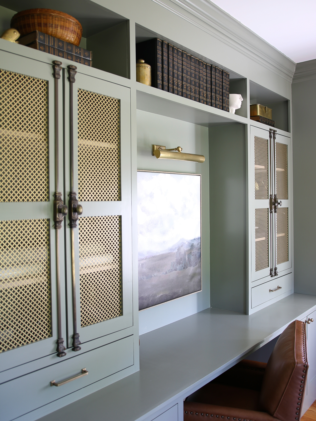
Round knobs | Drawer pulls | Picture light
Between that and the brass cabinet hardware, my home office has an atmosphere that feels serene and sophisticated. I don’t mind going to work!
Read all about the PAINT COLORS IN MY HOME for more ideas and inspiration!
