Sherwin-Williams Accessible Beige: Paint Color Review
Disclosure: This post may contain affiliate links. As an Amazon Associate, I earn from qualifying purchases at no additional cost to you.
Why I chose Accessible Beige for my home
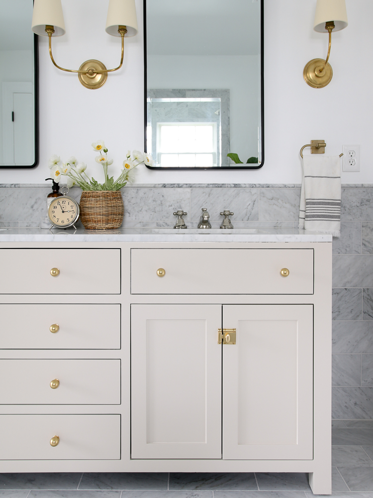
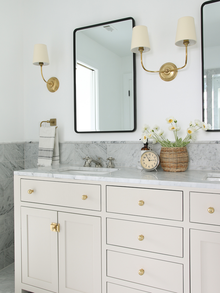
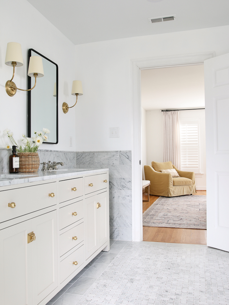
If you’ve been here a while, you may remember my primary bathroom remodel project. During the design process, I knew the star of the show was going to be the marble tile. I chose different sizes and styles for the vanity backsplash, floor, and shower – all a mix of cool gray and white. Sherwin-Williams Accessible Beige was the perfect choice.
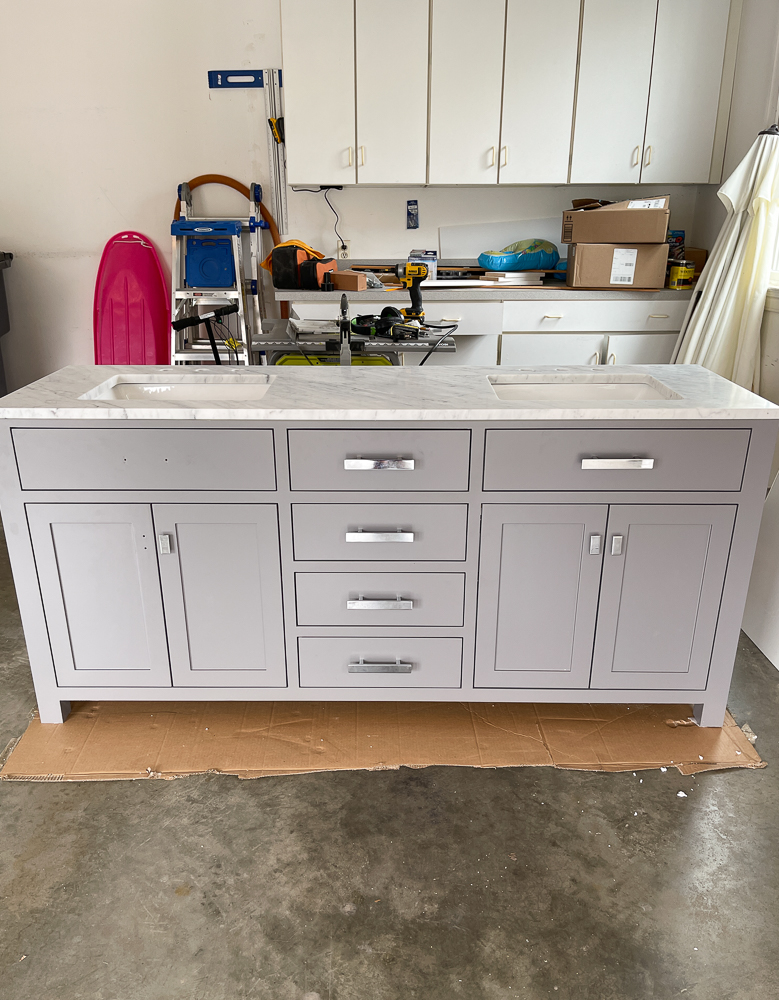
Between the pure white paint on the walls and the cool tones in the marble, I wanted the vanity to have a subtle warm contrast. The one I chose came with a marble countertop and sinks, but I didn’t love the color or hardware. So, what did I do? I gave it a makeover! I removed the factory pulls, filled the holes, sanded it all down, and used the perfect greige paint color.
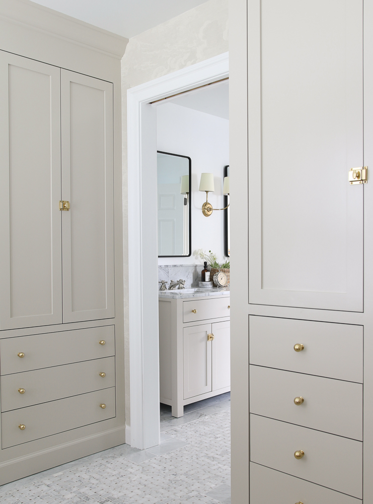
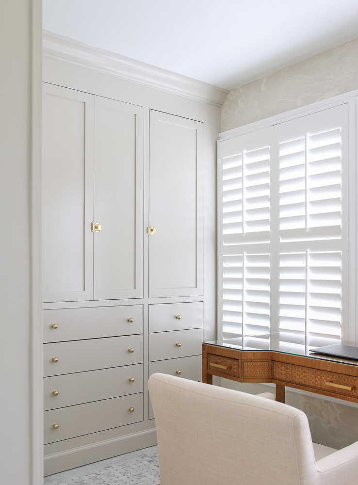
The adjoining closet is visible from the bathroom and since I carried the marble floor into that space, I did the same with the paint and gave my IKEA PAX shelves a complete makeover and created custom built-in cabinets. If you want to see how I did it, you can read my DIY closet tutorial! Accessible Beige looks beautiful in both spaces and complements the neutral wallpaper.
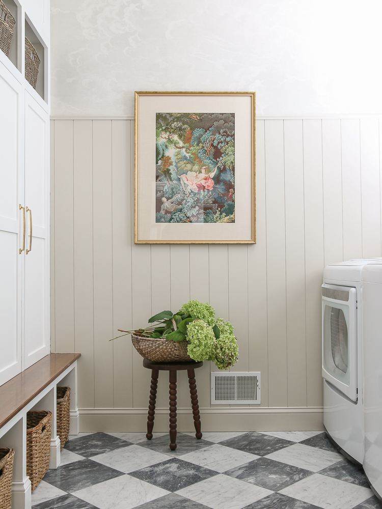
I used the same color scheme in my laundry room makeover too! The marble checkerboard floors are stunning when paired with Accessible Beige vertical shiplap walls.
Are gray and beige out of style?
Using neutral Earth-toned colors as the primary focus of your design shouldn’t be viewed as a “safe” option. Famous designers have been using a neutral palette forever, even on their most elaborate projects! I love being able to use specific decor pieces that express my design style against a neutral background.
I think it’s safe to say that everyone has their own style. Just because you love someone else’s design choices, doesn’t mean you have to get excited over every little detail. Maybe you love my marble bathroom floors but don’t care for my faucet choice or prefer unlacquered brass hardware. These are personal taste choices and as long as they are cohesive in the space…go for it!
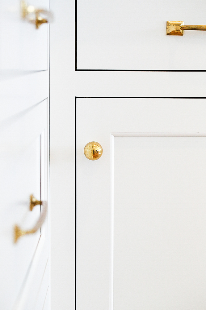
Vanity mirrors | Double sconce | Single sconce | Round knobs | Door latches
There are plenty of timeless design choices that may go in and out of what’s hot at the moment, like a white kitchen or red oak hardwood floors. But, if done correctly, having a warm gray or beige aesthetic will never go out of style. By this, I mean that if I see a photo of your space, it shouldn’t look like it was edited to be completely desaturated of color!
Is beige too boring?
Paint manufacturers probably have an entire department dedicated to coming up with creative names for their colors. Some of the names are pretty wild and you’ll find that crazy colors have crazy names, like Exuberant Pink and Electric Lime. You don’t have to see the colors to know they are bold and vibrant.
“Accessible Beige” doesn’t exactly give you goosebumps, but I’m going to share why this popular Sherwin-William color is anything but builder beige boring and my favorite paint color in my home.
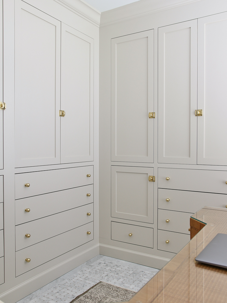
Round knobs | Door latches | Wallpaper | Desk | Chair | Marble floor tile
Is Accessible Beige more gray or beige?
The name kind of gives this one away. Do you remember when I shared that SW Agreeable Gray was a neutral gray with beige undertones? Well, SW Accessible Beige is the opposite. It is a neutral beige with a gray undertone making it another excellent option for the perfect greige paint.

Undertones for any color – even black and white – have a range that can be warm or cool. Think of it like a tint. For example, if you have a gallon of pure white paint and add just a tiny bit of yellow paint, that white paint will now have a slight yellow tint to it. The ratio of white paint is still far greater than yellow, but enough was added to affect the way it looks.
Round knob | Vanity mirrored tray | Refillable soap dispenser
Considering the undertones of Accessible Beige or any other color is important. Take some time to figure out the answers to these questions before you waste money on a bunch of paint that is going to look awful on the walls:
- Which direction is your home facing? If you haven’t done so already, open the Compass app on your phone and figure this out. How the sun rises and sets over your home will determine how the paint will look in each room. A north-facing room gets the most consistent light throughout the day. The amount of light you get will vary in other areas of your home.
- Is the room you want to paint only going to get morning sunlight and be dark in the afternoons? This means the ambient light will have a cooler temperature. Cool undertones of paint will be exaggerated in this situation.
- What about the opposite – do you need to close your drapes in the afternoon because the sun is blinding at that time of day? Warm undertones will be accentuated in these spaces.
What colors are similar to SW Accessible Beige?
If Accessible Beige isn’t the exact match you are looking for, you can give these other soft and subtle Sherwin Williams colors a try:
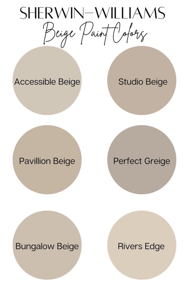
SW Accessible Beige – paint by numbers (and letters)
I’m certain you’ve been to your local home improvement store and studied the wall of colors. Did you notice all the numbers and letters on each swatch and wonder what they mean? In case you are interested in cracking the code, I will give a simple explanation of these values to help you make sense of it all.
RGB
Every paint color is assigned an RGB number which is a series of 3 numbers that represent the intensity of RED, GREEN, and BLUE in a particular color. The range for each color is between 0-255 with zero being the darkest and 225 being the lightest. If you do the math…there are over 16 million possibilities! Now you can understand why there are so many choices for EVERY color! Accessible Beige has an RGB value of 209/199/184.
HEX
The HEX number for color is made of 3 pairs of letters or numbers. Each pair is calculated from the RGB values to create a six-character combination. If you want to use a specific color on a computer screen graphic, you can simply type in the HEX number, and your color will pop right up. No guessing or trying to select the right spot on the color wheel! The HEX number for Accessible Beige is #D1C7B8.
LRV
Have you seen the letters LRV and wondered what they mean? The LRV number of paint refers to its Light Reflectivity Value. You can tell how dark the color will be from the LRV. The higher the LRV, the more light it reflects which means it will be light and airy. The lower the LRV, the less light it reflects, and it will be dark and moody. For example, SW Black Magic LRV is 3.0. By contrast, the LRV for SW Pure White is 84.0. Accessible Beige has an LRV of 58 which means it is light reflecting side of the scale, but slightly darker than Agreeable Gray.
Tips for choosing the BEST paint color
My number one recommendation is to try it before you buy it! Get several different paint sample colors including at least one shade lighter and darker than the color you are shooting for. This way you can see how the colors are going to look in different lighting situations.
Speaking of lighting, my second tip is to paint swatches on all four walls. I can’t emphasize this enough during the testing phase. I have changed my mind on paint colors numerous times all because I didn’t care for my original choice once I saw it in natural light – or lack thereof.
The last thing to be aware of is that paint may not look exactly like you expect it to when you first open the can. Don’t be alarmed! The dry finished product SHOULD match the color swatch from the manufacturer which makes it all the more important to get those samples up on the wall.
Looking for the perfect shade of grayish-green paint? Check out my review of Benjamin Moore Storm Cloud Gray.